Twice a year the International Monetary Fund publishes an estimate of how fast it expects each of 202 economies to grow, this year and for several years ahead. Those estimates are not only commentary. They are the raw material for deciding whether a poor country’s debts are affordable, and therefore whether it keeps getting lent to.
The best-known criticism of them is that they are too cheerful. One year ahead, averaged across every economy, the Fund’s growth forecast comes in 0.85 percentage points above what actually happens. That number is repeated constantly, usually as evidence of institutional temperament.
It survives being split by income group. It does not survive being split by how far ahead the forecast was made.
Two different kinds of wrong
A forecast can miss in two ways that look identical in a summary statistic and are not remotely the same problem. It can lean, producing errors that point the same direction year after year. Or it can scatter, producing errors that are large but unpredictable in sign. The first is correctable by subtracting a constant. The second cannot be corrected at all.
Divide the average bias by the average size of the miss and the two failures separate cleanly. For advanced economies one year out, 46 per cent of the typical error is systematic lean; by two years it is 61 per cent. For emerging and developing economies at one year it is 11 per cent. Their forecast is barely biased. It is simply noisy.
That inverts the familiar complaint. At the horizon most people quote, the Fund’s developing-country call is close to unbiased, and it is the advanced-economy call that carries a persistent one-directional lean which 36 years of publication has not removed.
How much of the miss is a lean, and how much is noise
Average bias as a share of average error. A high bar means the error repeats in the same direction and could be corrected by adjusting the forecast down. A low bar means the error is real but unpredictable in sign, and no adjustment helps.
The same-year column deserves a second look, because it runs the other way and holds the largest systematic share anywhere in the table. Two-thirds of the Fund’s same-year error on developing economies is a lean, and the lean is downward: minus 0.51 points. The forecast is reliably gloomy about the one year it already knows most about.
By the fourth year, the order reverses
Follow the bias outward and the two groups trade places. Advanced economies peak at plus 0.65 two years ahead, then ease back to plus 0.54. Emerging and developing economies climb without pausing: plus 0.13, plus 0.34, plus 0.50, plus 0.60, plus 0.66. Somewhere between the third and fourth year the developing-country forecast becomes the more optimistic of the two, and it keeps going.
Where the optimism actually lives, and where it ends up
Average forecast error by horizon. Above zero is too optimistic, below zero too cautious. The advanced-economy line leaves zero immediately and then flattens. The emerging line starts half a point below it and overtakes it by the fourth year.
And the gap keeps widening
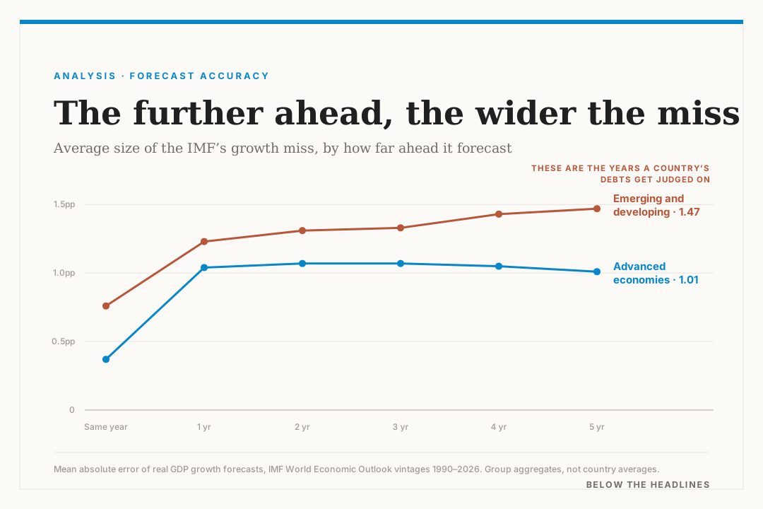
Bias is only half of it. The size of the miss moves the same way and more decisively. Advanced economies flatten almost immediately: 1.04 points at one year, then 1.07, 1.07, 1.05, and 1.01 at five. Four extra years of distance cost a rich economy nothing measurable.
Emerging and developing economies start higher and keep climbing: 1.23, 1.31, 1.33, 1.43, 1.47. The ratio between the two groups widens from 1.2 at one year to 1.5 at five.
The gap widens with every year of distance
Mean absolute error, the average size of the miss regardless of direction. The dashed line runs the same calculation country by country across all 202 economies rather than on bloc aggregates, where offsetting national errors no longer cancel each other out.
By the fourth year the developing-country projection is worse on both measures at once: more biased and less precise. It is the only cell in the table where the two failures compound instead of trading off. Every other combination hands you one problem or the other.
That dashed line is a separate warning. Run the calculation country by country instead of on bloc aggregates and the one-year error is 2.76 points, not 1.04, because offsetting national errors stop cancelling. The bloc figure is the most reassuring number in the file and the least applicable to any actual finance ministry.
And that is the number the debt tests use
A forecast error stays academic until something is decided on it. Debt sustainability analysis is where these numbers stop being commentary. The framework the Fund and the World Bank apply to low-income countries works out what a country’s debt will look like as a share of its economy several years from now, then checks that against a threshold. The answer depends almost entirely on how fast the economy is assumed to grow in those years.
That is the four-to-five-year cell: the worst-performing forecast the institution produces on both measures simultaneously, and the one carrying the most weight.
The mechanism is not subtle. A debt-to-GDP ratio has growth in its denominator. Overstate growth by half a point a year for five years and the projected ratio lands materially below where it actually arrives, which is the difference between a country being judged able to carry its debts and being judged unable to. That verdict decides whether cheap official loans keep arriving or whether a restructuring conversation begins.
Nobody is quite sure what actually happened either
There is a further problem underneath this one, and it undercuts the whole exercise of measuring forecast error in poor countries.
The “actual” in this archive is the latest available estimate for each target year. For advanced economies that estimate is stable. Where statistical offices are thinly resourced it is not. Countries periodically rebuild their national accounts from a newer base year, an exercise called rebasing, and the results can be enormous: Nigeria’s move to a 2019 base revised the measured size of its economy up by roughly 41 per cent. Ghana’s 2016 rebasing cut its reported debt ratio by around 20 percentage points in a single year. The Carnegie Endowment notes that this alone spared it a verdict of unsustainable debt on what was otherwise an explosive path.
When the benchmark moves that much, part of what gets recorded as forecast error is really statistical revision. The Fund is being scored against a number that was itself being rewritten. That does not excuse the record; it means the true uncertainty around a developing-country projection is wider than even these figures suggest, and wider in a way nobody can quantify beforehand.
The countries at either end
Rank individual economies by average bias at one to three years, with at least 30 forecasts each, and the most over-promised list reads like an inventory of places where measurement is hardest: Macao at 6.58 points, Yemen at 4.91, South Sudan at 4.65, Palau at 4.30, Iraq at 3.90, the Democratic Republic of the Congo at 3.52 and Haiti at 3.49.
The extremes, and what they have in common
Average growth-forecast bias at one to three years ahead, for economies with at least thirty forecasts on record. Both tails are dominated by small, concentrated or conflict-affected economies rather than by any income group as such.
The other tail is shorter and more instructive. Equatorial Guinea is underestimated by 5.89 points on average, Aruba by 3.42, Ireland by 2.14 and Guyana by 1.42. Ireland is not a data-poor country by any standard; its output was repeatedly redefined by corporate relocations large enough to move the national accounts by double digits, and Guyana’s by an offshore oil discovery. Badly measured, very small, or highly concentrated: all three produce the same failure, and a forecaster cannot tell them apart in advance.
How to read the next one
None of this argues for discarding the Fund’s work. Its current-year call is genuinely strong, its data collection has no substitute anywhere, and the archive that makes this criticism possible is one the institution compiles and publishes itself. Very few forecasters expose their own record this thoroughly, and almost none make it this easy to check.
It argues for three habits. Read the horizon before the number, because past the current year an advanced-economy forecast carries a known half-point lean that can simply be subtracted. Read the income group second, because a developing-country forecast cannot be corrected that way: its error is mostly noise until the fourth year and mostly compounding after it. And treat any five-year growth path for a low-income economy as a scenario rather than a projection, particularly when a threshold test is about to be run against it.
The Fund has published the evidence for all three. It sits in the same file as the forecasts.
This is the layer below the headline.
Sources
Every figure in this piece traces back to a published document or report. Follow them.
- World Economic Outlook — all issues and historical forecast vintagesInternational Monetary Fund
- Getting Debt Sustainability Analysis Right: Eight Reforms for the Framework for Low-Income CountriesCarnegie Endowment for International Peace
- Changes to the WEO DatabaseIMF Data
- Nigeria’s GDP rebasing: implications and opportunitiesDataphyte